
The following Emory Campus Life (ECL) branding standards have been established using Emory University branding guidelines to ensure consistency in the development of ECL collateral and communications. (Note: >ECL branding guidelines are superceded by Emory University branding) As one of the largest units at Emory University, it is vital to maintain a visual consistency so our audiences understand and know who ECL is and what ECL does.
Overview
Per Emory University branding guidelines, each major university unit (and subsequent departments) can request a unit signature that features the EMORY wordmark, shield, and department/unit name. One should not attempt to recreate unit signatures by typing Emory or the department names in a word-processing application; unit signatures are designed vector art using a specific font and set of measurements.
To request an identifier for your department, please complete the Project Request Form. Identifiers are requested through central marketing/communications and may take up to 8 weeks to finalize.
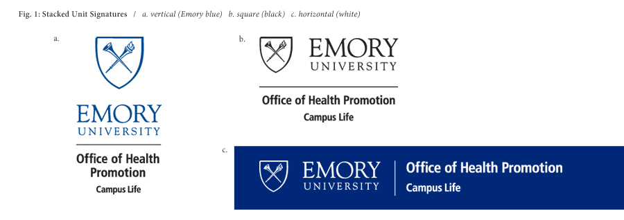
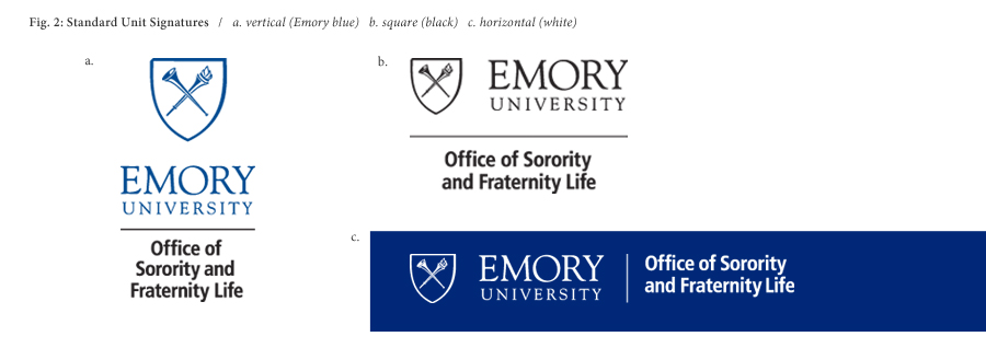
A full set of unit signatures will include the Emory logo combined with the department name as a standalone (“standard”), and stacked over Campus Life (“stacked”). Departments will receive both standard and stacked logos in three colors: Emory blue (PMS280), all black, and “reverse” (all white). Both styles will also be designed in three configurations: horizontal, square, and vertical.
For more information regarding Emory logo usage:
Unit Signature Usage
When possible, using the stacked logo is preferred in order to identify the department as a part of Emory Campus Life. Understandably, there will be situations where multiple unit signatures may be used (i.e. co-sponsored events), and it may be more visually appealing to use the un-stacked variant or an alternate logo. That said, please strive to reference Emory Campus Life as much as possible visually.
Unit signatures should always be resized proportionally. In many image editing programs, this involves holding the SHIFT key while dragging the cursor to re-size. For more information, see the seciton titled "Adding or Changing Elements" on the Logo Use page.
Emory Eagles: Athletics Logos
Athletics branding is reserved for varsity sports and the Athletics department only. If you are partnering with Athletics on an event, and need their brand kit for your design, please contact John Farina at jfarina@emory.edu.